Company
RubyLife
Product
Ashley Madison
Segment
Dating
Role
Product Designer
Research Methods
Competition analysisUser interviewsSurveysA/B Testing
Ideation
WorkshopsUser journeysUser flowsPaired sketching
The Challenge
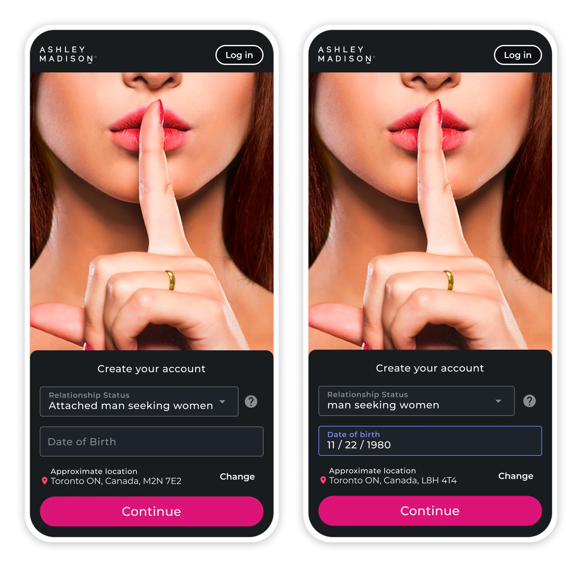
Our design team was presented with an opportunity. Our developers informed us that sign up needed a complete rewrite and that they could copy the exact sign up that was currently live or they could implement something new. We had been discussing a complete overhaul of sign up and onboarding so we seized the opportunity to test improvements to the sign-up experience.
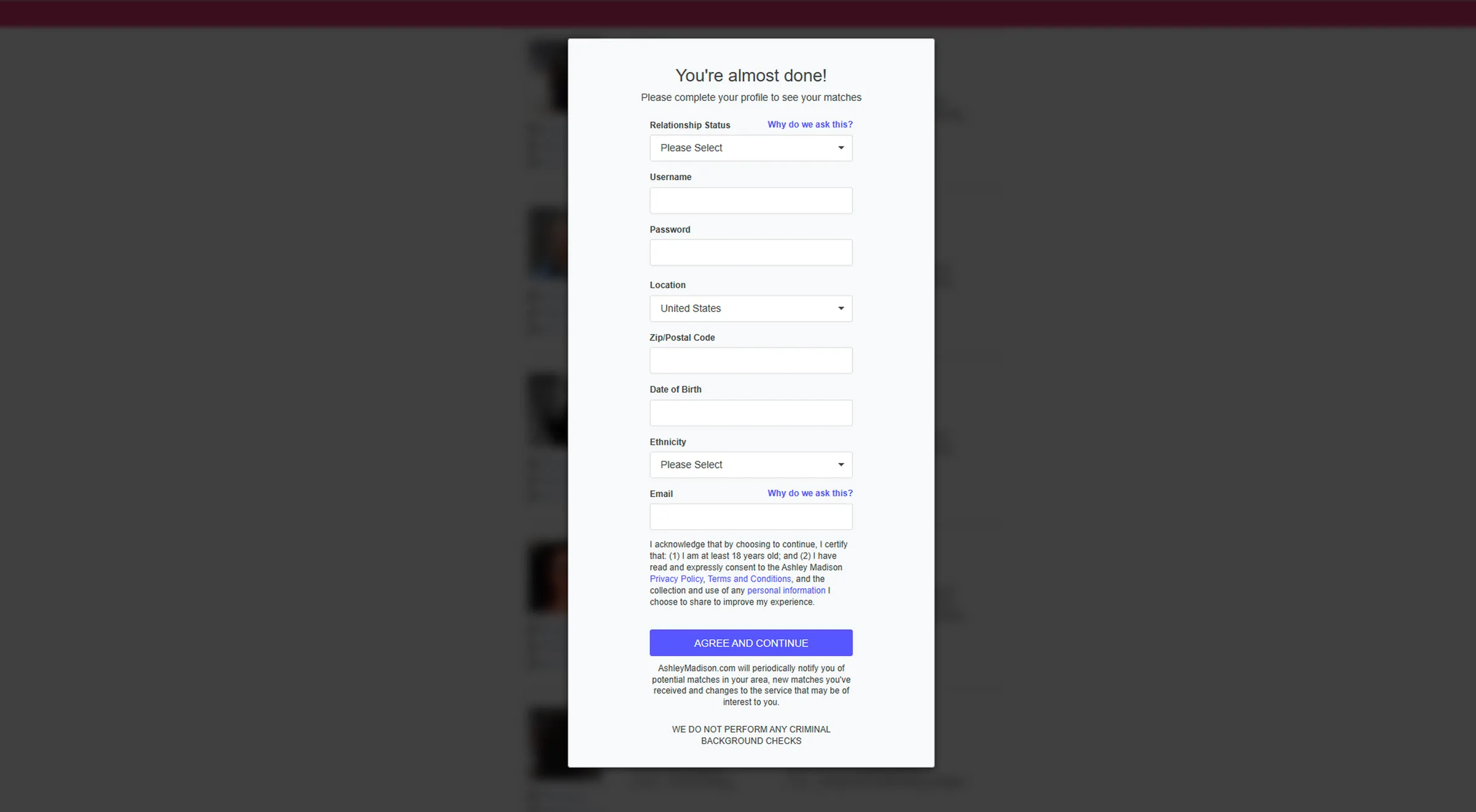
We identified key issues:
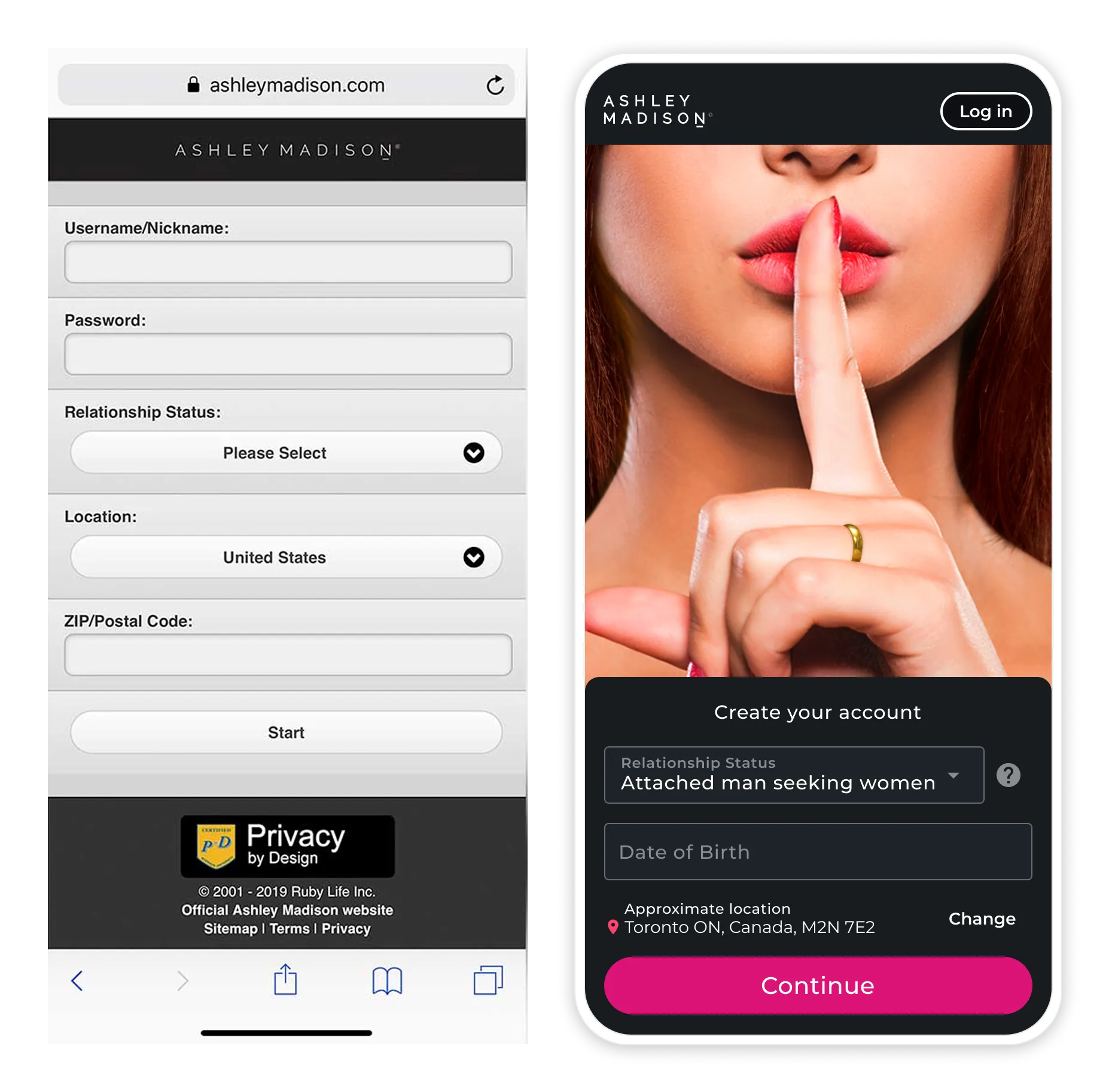
- Fragmented UX between desktop and mobile
- Excessive form fields led to drop-off
- Outdated UI that misaligned with our brand
- Split codebases which complicated maintenance and consistency
While we couldn't yet deliver the full vision of a seamless, stepped, sign-up integrated with onboarding, this interim redesign allowed us to validate improvements and collect valuable data.
The Goal
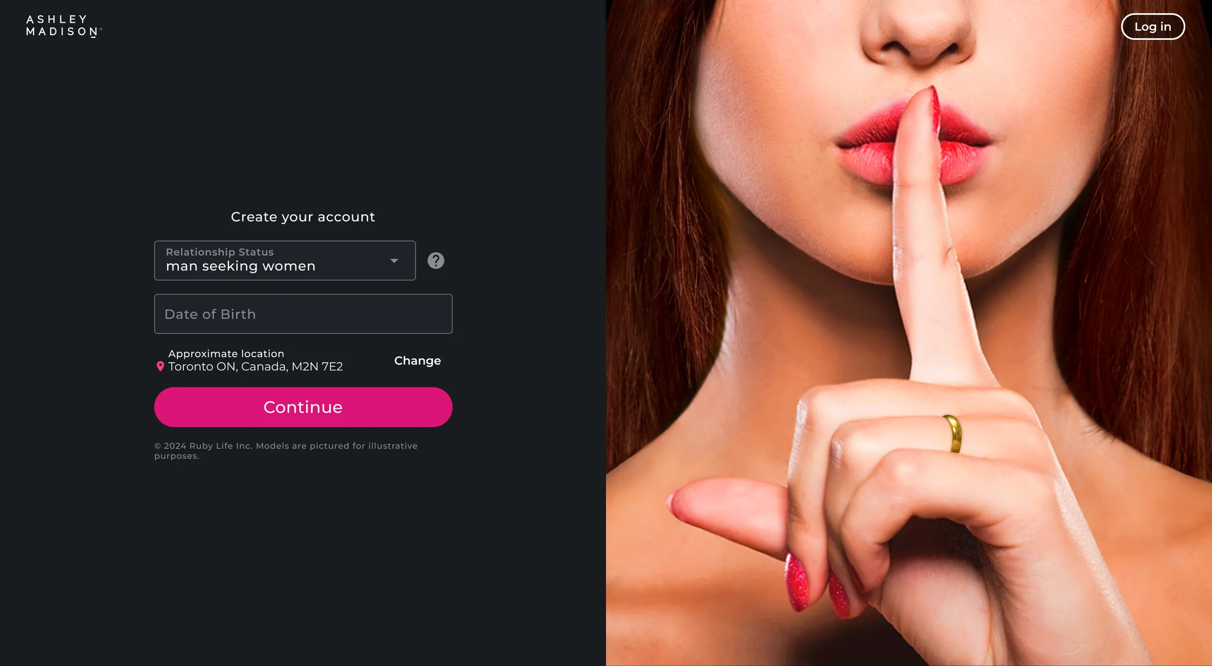
Design an improved sign-up flow that increases completion rates and reduces user frustration—without disrupting backend architecture.
We aimed to:
- Increase sign-up completions
- Unify the experience across platforms
- Test usability patterns to inform the future onboarding experience
Research
With limited quantitative data, we turned to qualitative methods:
- Heuristic analysis revealed major usability gaps in form design and error handling
- Competitive analysis surfaced best practices from modern sign-up flows
- Internal interviews with Sales and Support highlighted real-world friction points
Key Findings:
- The form lacked auto-complete, helpful hints, and smart validation
- Error messages were vague and unhelpful
- Username selection lacked suggestions or availability feedback
- Some fields had no clear initial use or business value
These insights guided our decision to streamline the experience with targeted, high-impact updates.
Solution
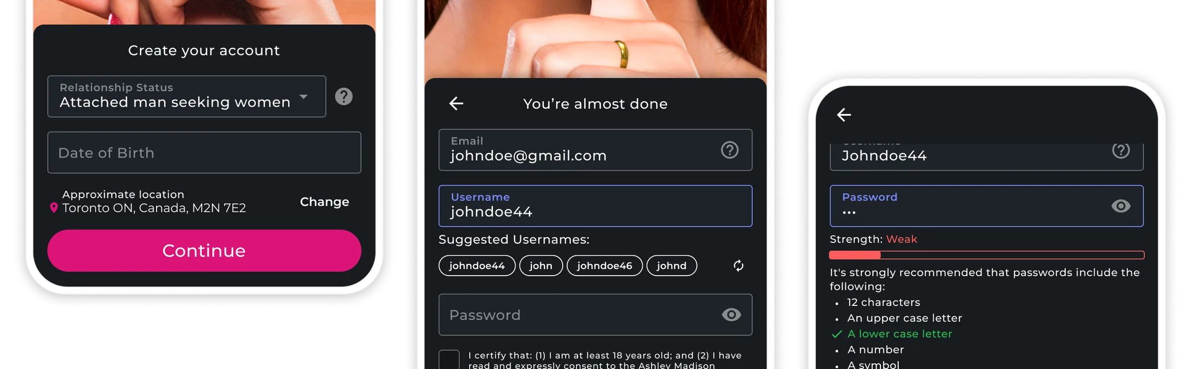
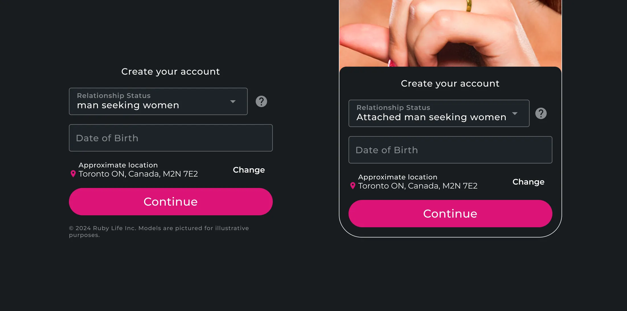
Form Field Optimization
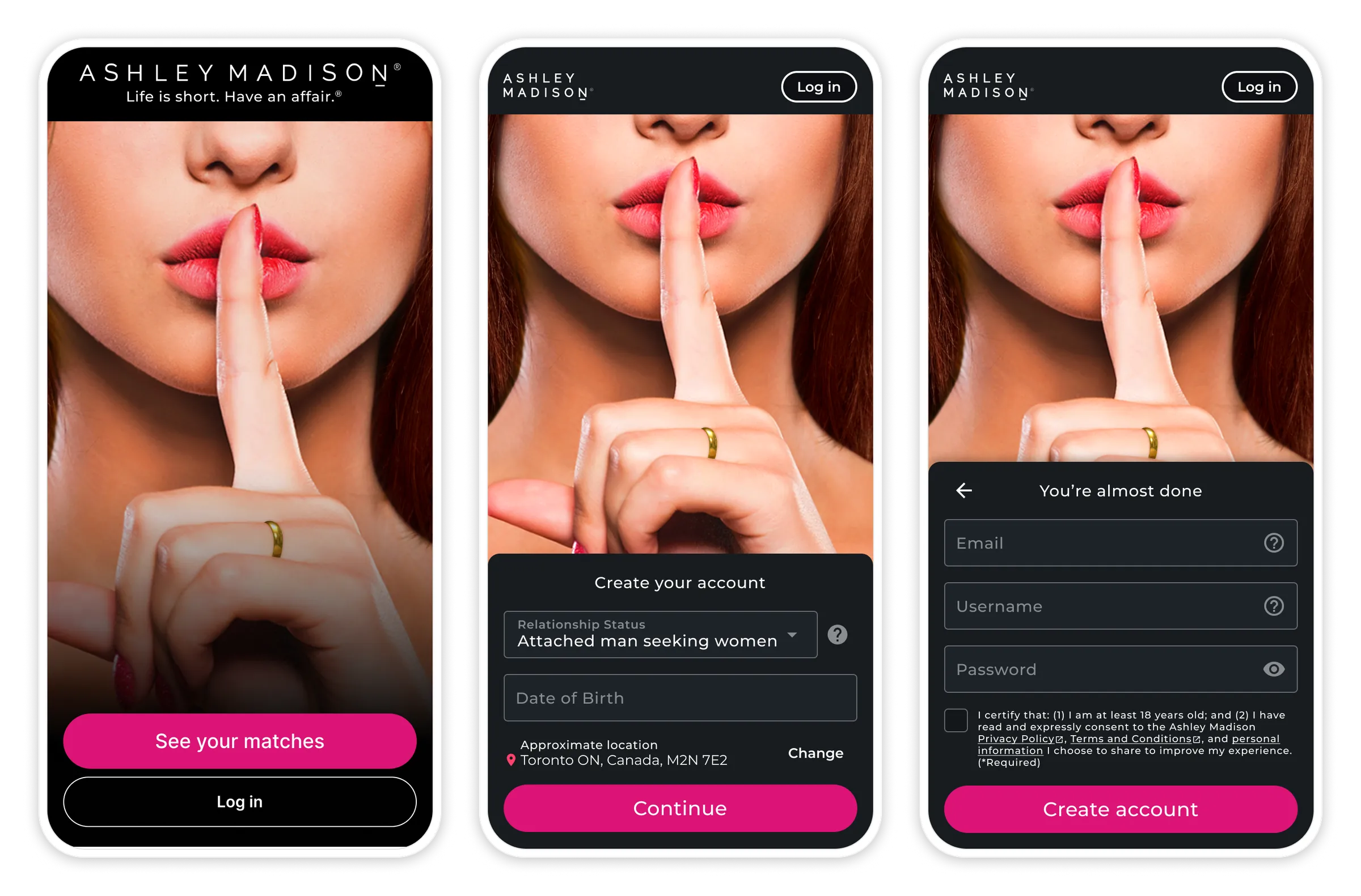
- Reduced required fields - From 8 down to 6 to shorten the form
- Deferred non-essential inputs - Moved to onboarding instead of sign-up
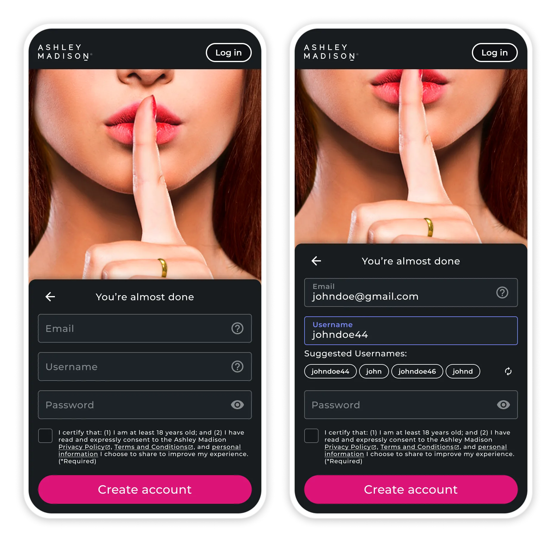
- Added real-time validation - Username availability checks and smart suggestions as users type
- Introduced auto-complete - For location fields to reduce typing
Cross-Platform Consistency
- Unified responsive design - Maintained visual and functional consistency across all devices
- Consolidated codebases - Merged separate desktop and mobile implementations into one
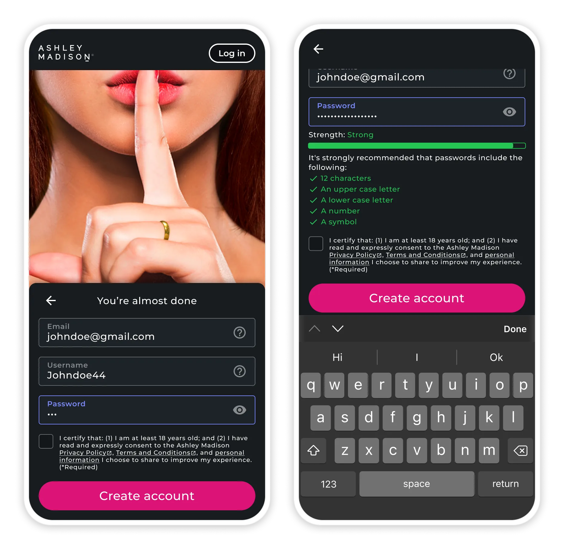
- Standardized validation - Consistent rules and error messaging across the form
- Optimized auto-complete - Tuned behavior for both desktop and mobile contexts
Design System Implementation
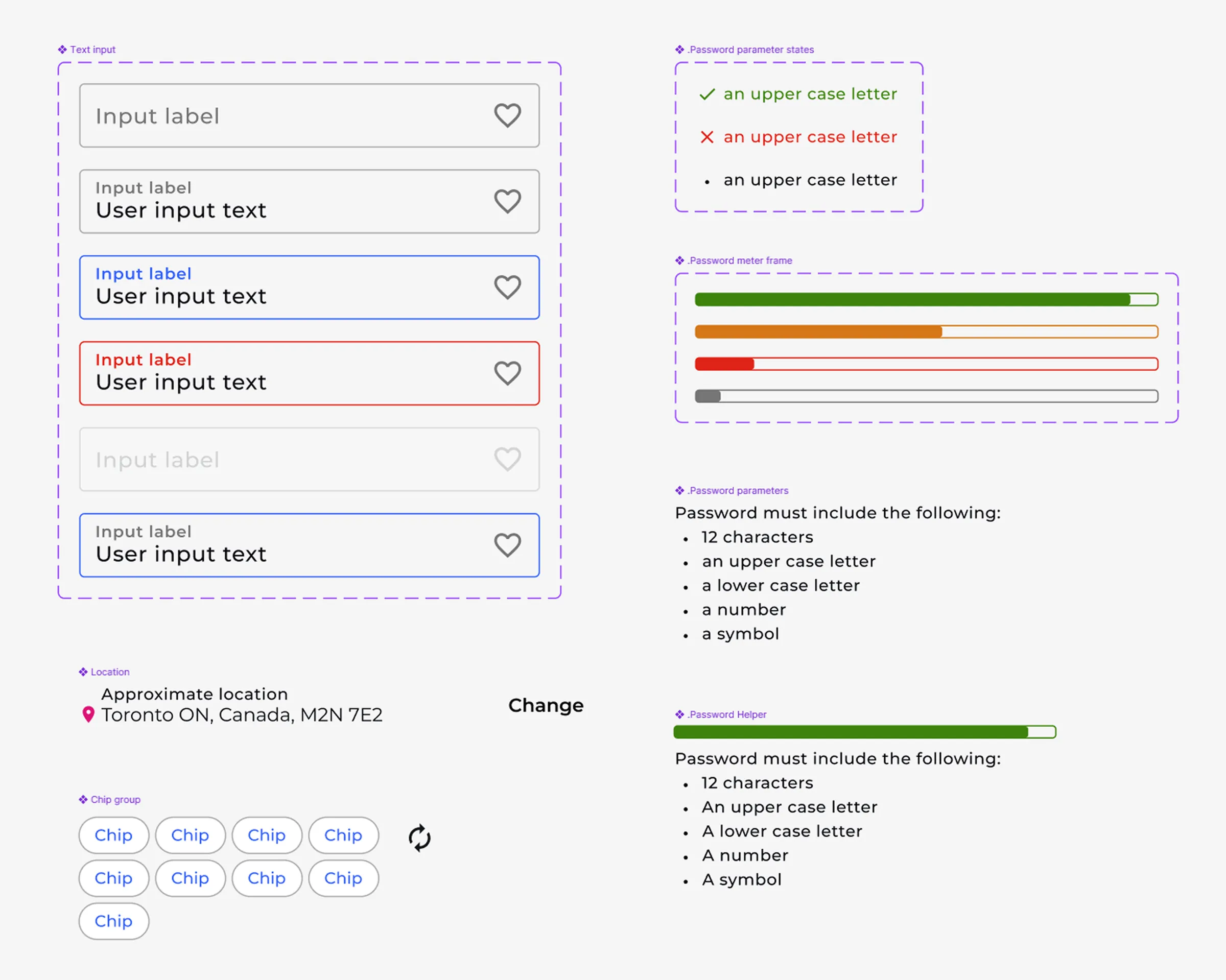
- Applied design system components - Used throughout the form for a consistent look and feel
- Reused established patterns - For input fields, validation states, button styles, and typography
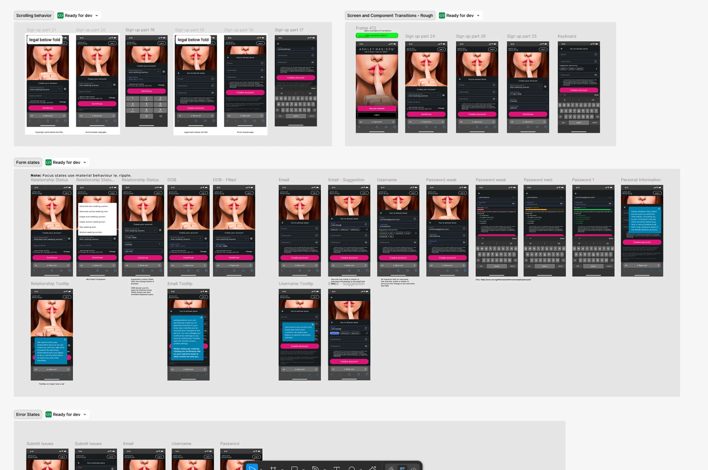
- Enhanced accessibility - Focus states, error handling, and ARIA support
- Added field-level feedback - Real-time hints and validation messaging as users type
Implementation
We collaborated closely with the engineering team to embed design improvements into their ongoing rewrite. Steps included:
- Design Collaboration - Worked in lockstep with engineers to identify integration points
- Prototyping & Testing - Created lightweight prototypes and conducted usability testing with internal stakeholders
- Developer Handoff - Delivered detailed specs for new form behaviors and edge cases
- Incremental Integration - Implemented features in sync with backend updates
- QA Focus - Prioritized testing for validation, auto-complete, and responsiveness
Results
The redesigned sign-up flow immediately improved usability. Users found it faster and more intuitive, while support teams reported fewer registration issues and less confusion.
A unified sign-up experience and streamlined form reduced friction across platforms. Internally, teams gained confidence in the flow, validating key improvements ahead of the full onboarding revamp.
Lessons Learned
This interim sign-up redesign reinforced several key principles:
- Small improvements matter - Focused, meaningful updates to error handling, auto-complete, and username suggestions can significantly enhance user experience
- Consistency builds trust - Cross-platform alignment created a smoother, more predictable experience
- Design systems accelerate delivery - Pre-built components enabled rapid prototyping and development
- Developer collaboration is essential - Aligning our design changes with planned code rewrites created efficiency and adoption
Next Steps
With the interim solution in place, we started preparing an integrated sign-up and onboarding process:
- Use insights from this project to inform the future seamless sign-up experience
- Preparing design system components specifically for multi-step processes
Additional Screens