Company
RubyLife
Product
Ashley Madison
Segment
Dating
Role
Product Designer
Research Methods
Competition analysisUser interviewsSurveysA/B Testing
Ideation
WorkshopsUser journeysUser flowsPaired sketching
The Challenge
Soon after I joined Ruby Life, the company undertook a significant UI overhaul of their flagship platform, Ashley Madison. The update involved a stepped release approach to ensure the new front-end codebase was properly integrated with the existing PHP backend infrastructure. During this transition period, several critical challenges emerged:
- Rapid developer growth led to an influx of new developers working across different aspects of the platform, resulting in duplicate components and visual inconsistencies from page to page
- No standardized component library meant developers were recreating similar UI elements with subtle variations, creating a maintenance burden
- Slow implementation cycles meant it took many weeks for new features, often accompanied by numerous bugs requiring additional fixes
- Disjointed brand experience for users navigating through different sections of Ashley Madison, with inconsistent styling, interactions, and visual language
As the platform's single biggest grossing product was being prepared for international expansion with localized versions, these inconsistencies threatened to multiply exponentially. I was tasked with creating a design system to address these challenges while establishing a cohesive brand identity that could scale efficiently with the company's ambitious growth plans.
The Goal
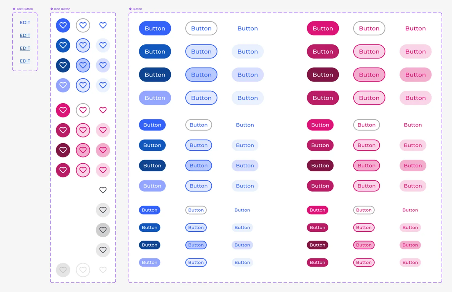
Build a scalable design system that could unify Ashley Madison's front end, eliminate duplicate components, and hold up under the platform's international expansion.
- Establish a single source of truth for components, color, type, and spacing
- Reduce development time and bugs caused by duplicate or inconsistent UI elements
- Enable theming and white-labeling to support localized, international versions of the platform
Research
After auditing the Ashley Madison platform, our design team found significant fragmentation and the need for a robust design language. To build organizational support, we:
- Consulted developers who expressed frustration with inconsistent specifications and duplicate components across the platform
- Consulted product managers about how a design system would increase development throughput, reduce bugs, and create a more cohesive experience
Based on these insights, my approach to building the design system centered on three key principles:
- Atomic Architecture: Building foundational elements to complex patterns
- Practical Flexibility: Creating components adaptable enough for various contexts
- Developer Experience: Ensuring seamless implementation and adoption
Foundation
Color System
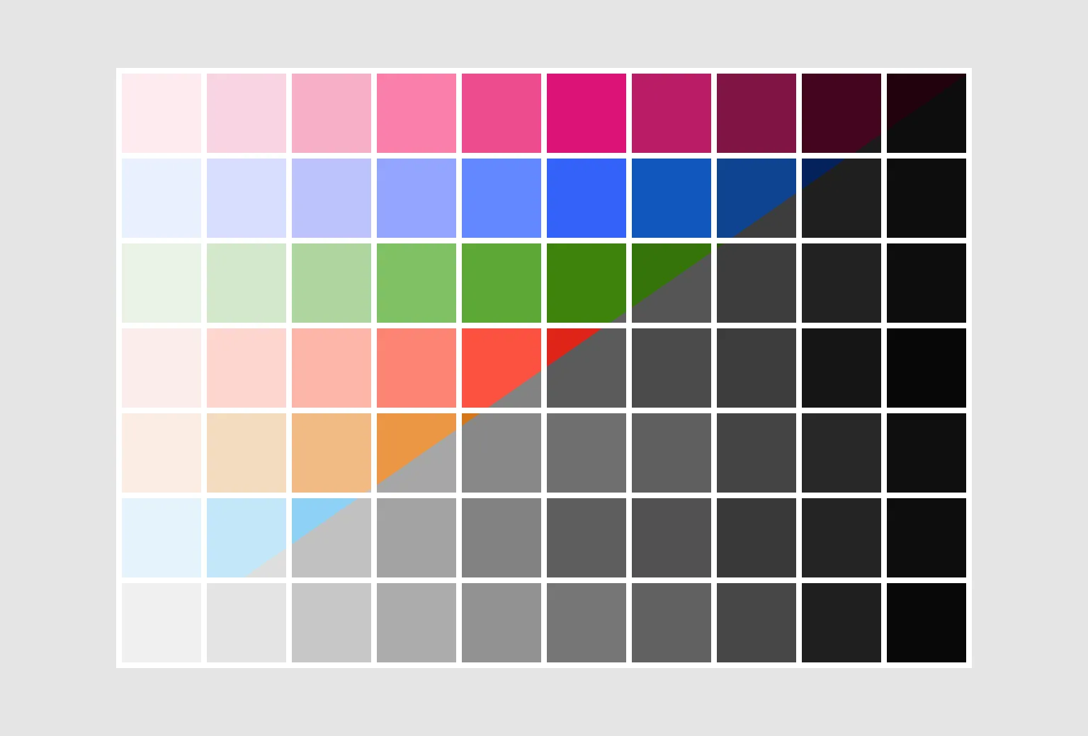
I developed a systematic color approach using the LCH color space, which provided perceptually uniform color variations that appear more natural to the human eye. The primary palette was expanded to include 10 tonal variations for each color, ensuring consistency and accessibility across all UI elements.
Key decisions included:
- Color variations were first created mathematically and were then tuned based on perceived visual weight resulting in more intuitive and harmonious color relationships
- Eliminating gradient buttons and gradients under text to ensure all elements passed accessibility requirements
- Ensuring WCAG AA contrast standards were met across all text/background combinations
- Defining specific semantic color applications for consistent user feedback
Typography
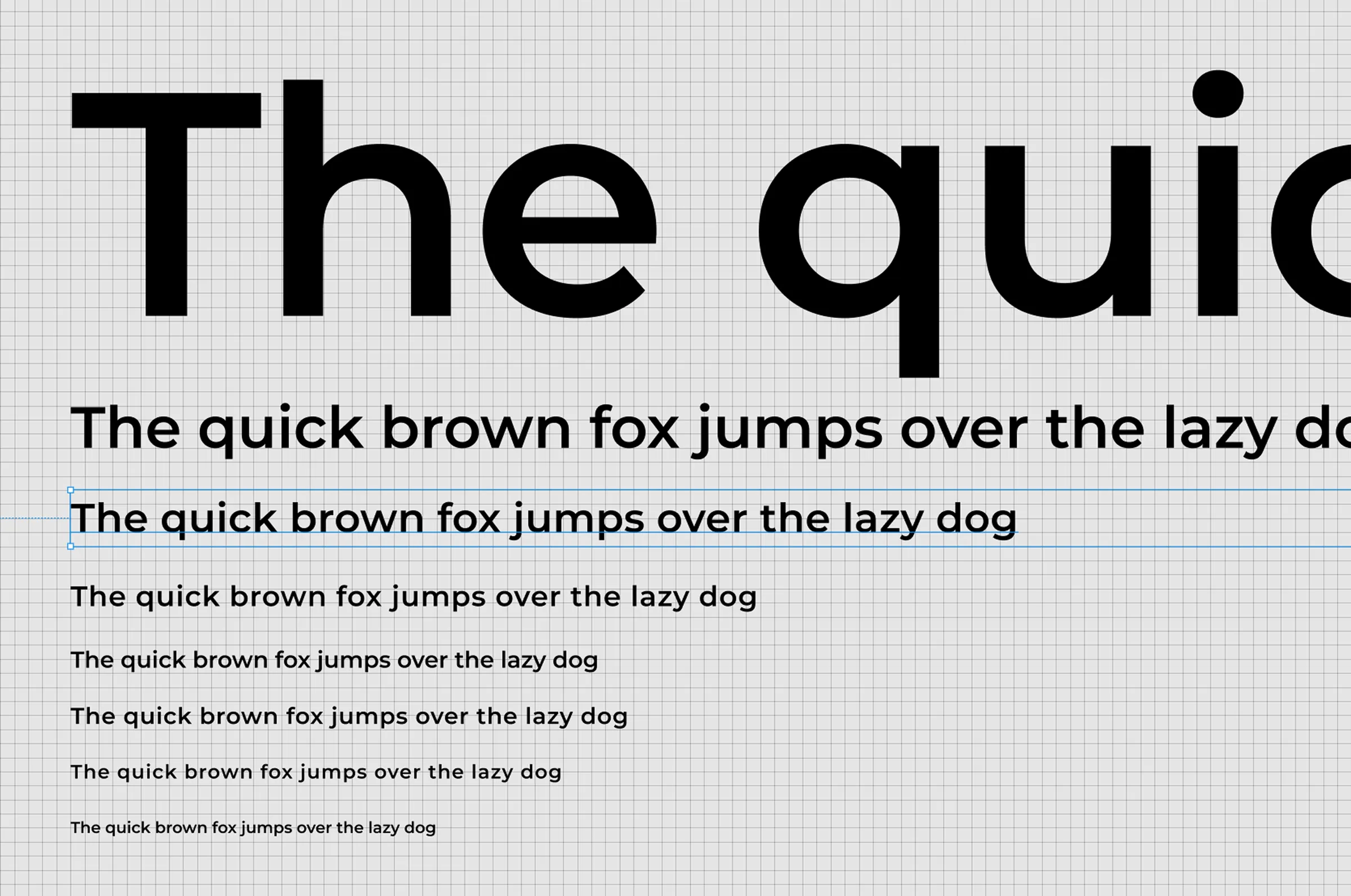
The typography system was divided into two variants: Productive and Expressive:
The Productive variant was built with Montserrat and Inter. It included three heading levels with defined weights, sizes, and line-heights to establish a clear visual hierarchy. Additionally, five body text styles were designed to suit various UI contexts and reading scenarios, supported by responsive type rules to ensure readability across breakpoints.
The Expressive variant provided marketing teams with greater creative flexibility while preserving alignment with the overall brand. It enabled more distinctive and impactful typography for promotional content without compromising the core design language.
Spacing & Grid
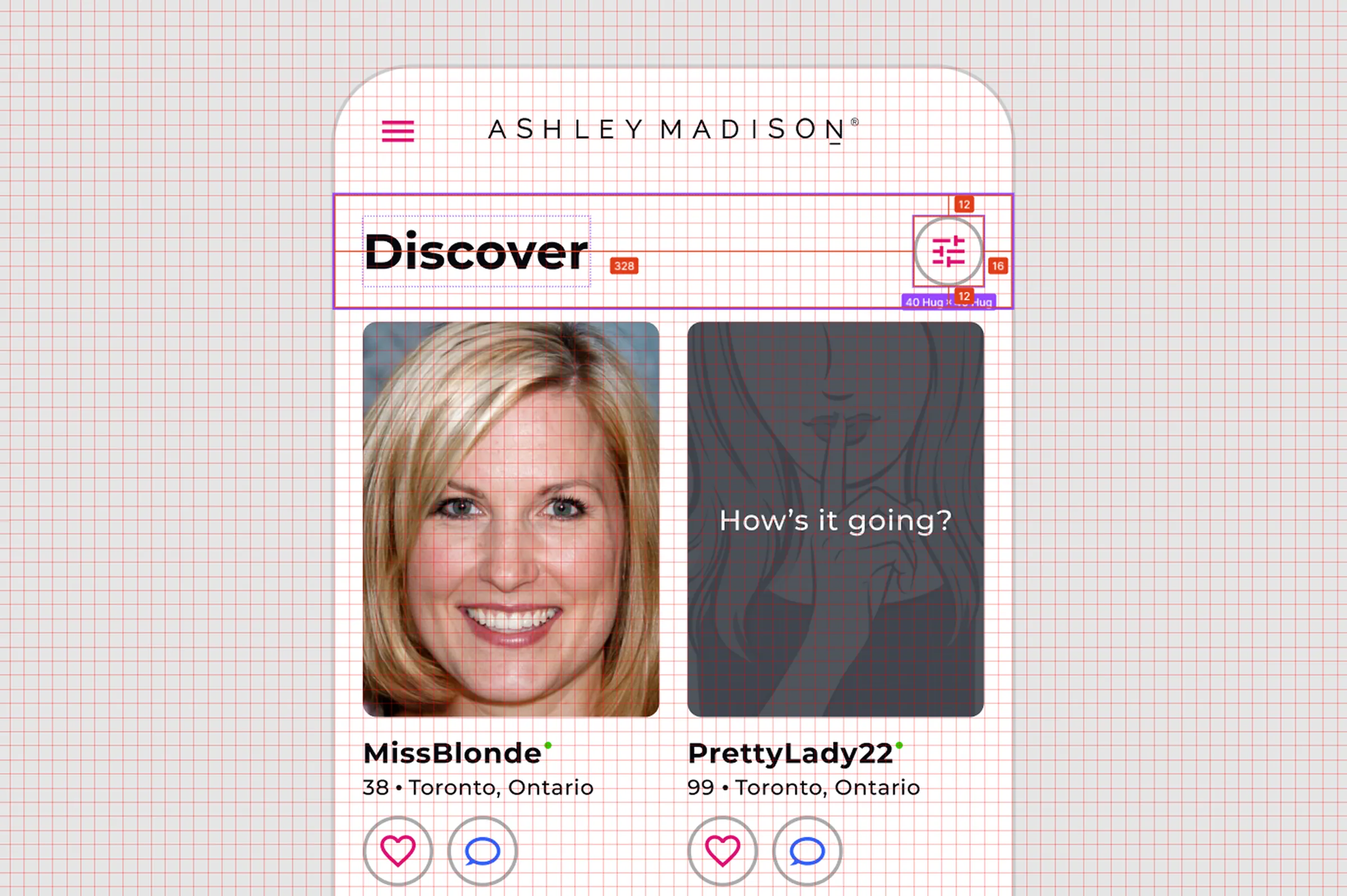
I decided to use a 8pt grid to maintain visual rhythm across all interfaces. The spacing tokens ranged from 4pt to 64pt, with comprehensive guidelines for component padding, margins, and layout spacing.
The responsive grid system included:
- 12-column structure with flexible gutters
- 5 defined breakpoints with behavior specifications
- Container constraints for optimal line lengths
Naming Conventions & Token Structure
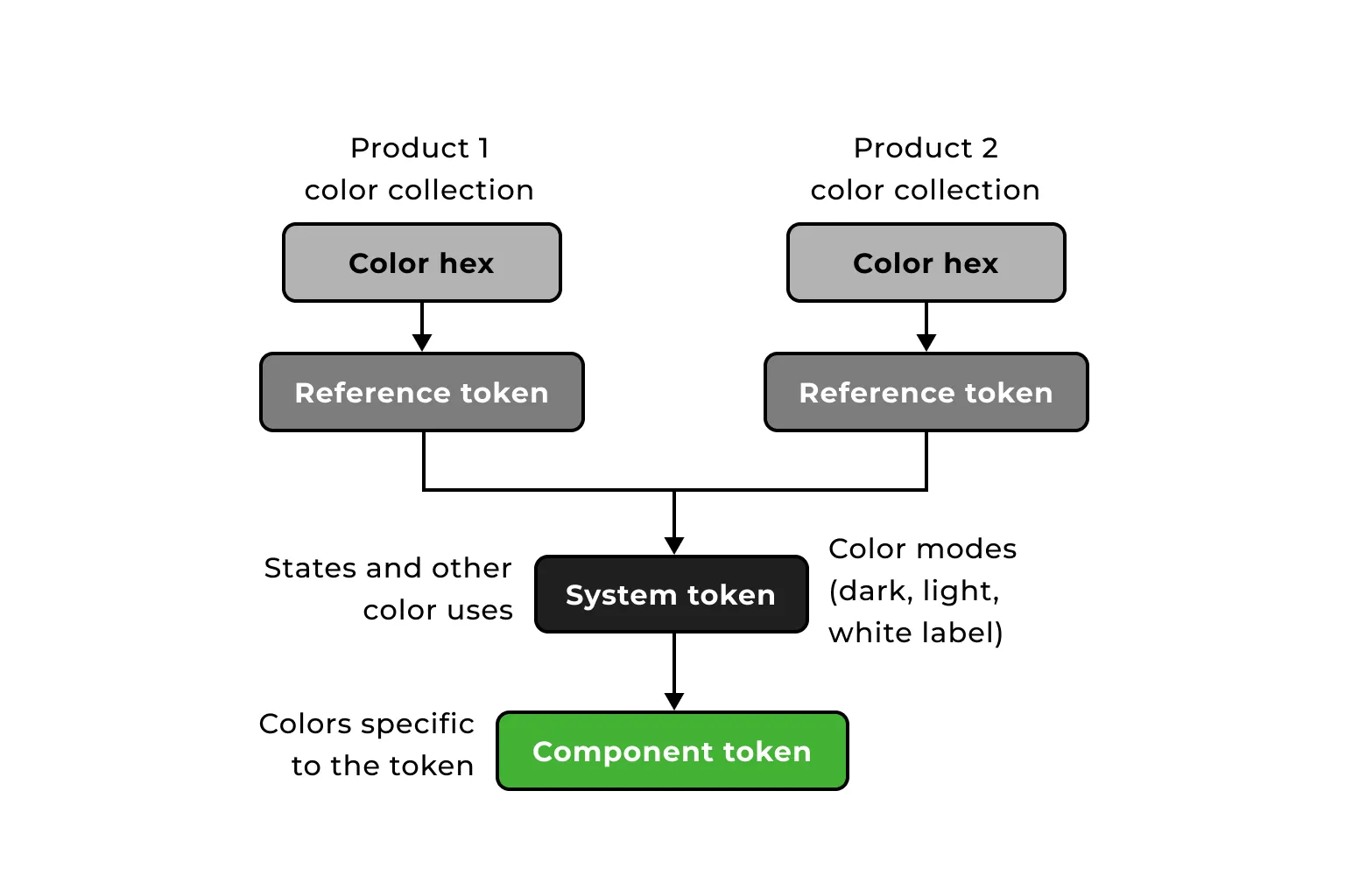
I used a hierarchical token system that enabled flexibility while maintaining design consistency. The structure consists of three distinct layers:
- Raw tokens: Base-level tokens containing the actual hexcode values (e.g., blue-600: #0052CC)
- System tokens: Mid-level tokens that assign semantic meaning (e.g., color-secondary: blue-600)
- Component tokens: High-level tokens used directly in component definitions (e.g., button-primary-container: color-secondary)
This layered approach provides several advantages:
- Theme switching capabilities for dark mode by simply swapping system token references
- White labeling flexibility for different products by changing raw color values while maintaining relationships
- Consistent component appearance across design files and code implementation
- Single source of truth that cascades changes efficiently throughout the entire system
Component Library
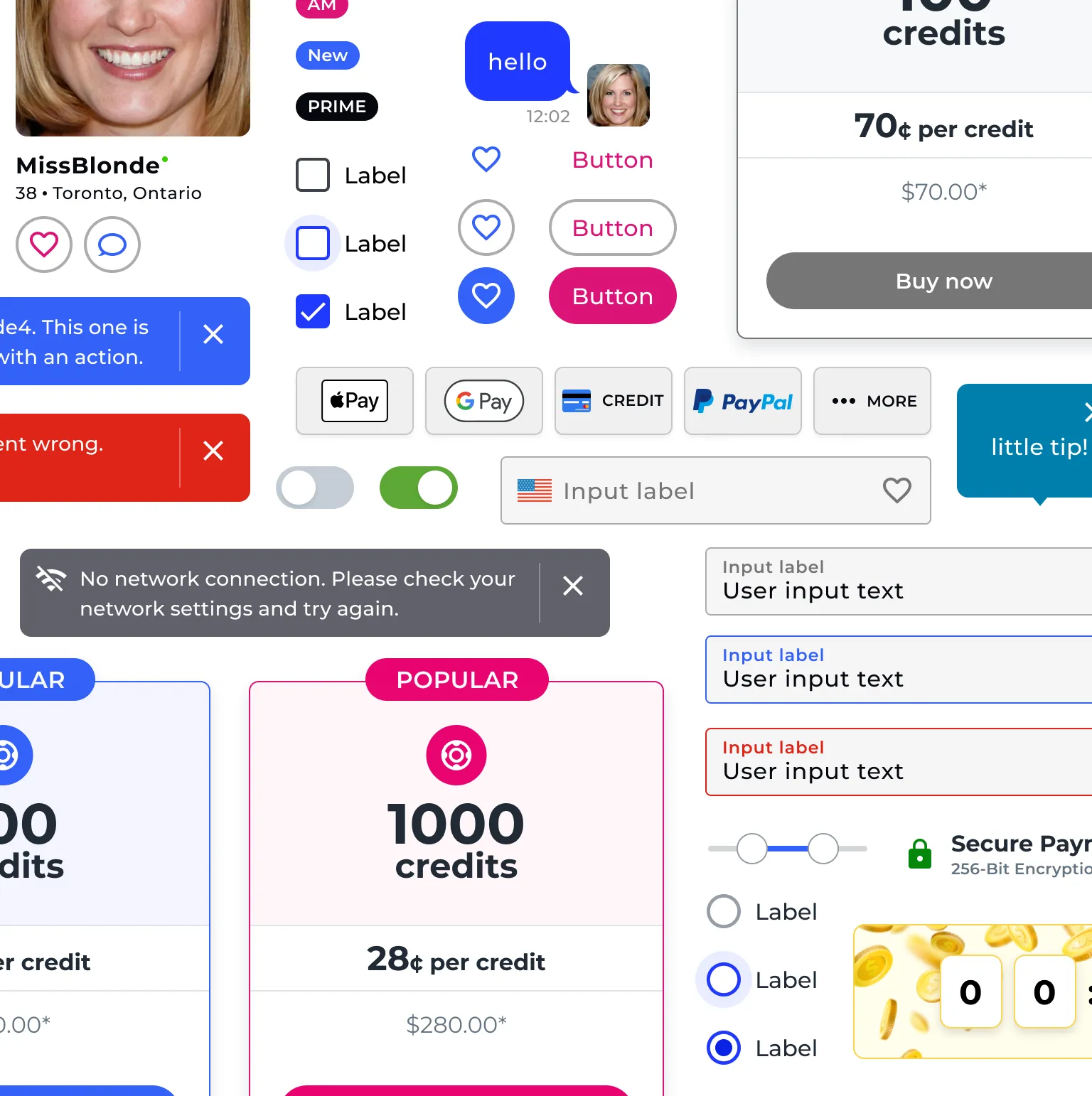
Starting with atomic elements, I gradually built up a comprehensive component library. Each component went through a rigorous process:
- Analysis of existing patterns and use cases
- Documentation of states, variants, and behaviors
- Design of flexible, composable components
- Developer handoff with precise specifications
- Implementation review and refinement
Implementation
I collaborated with our front-end team to implement the system as a React component library. This involved:
- Creating a Figma library synchronized with our code implementation
- Building interactive Storybook documentation with usage guidelines
- Establishing naming conventions and prop structures for developer clarity
- Developing contribution guidelines for system growth
Rollout
We initially planned a comprehensive 'big bang' implementation of the design system across all product interfaces. However, following a change in leadership, our strategy shifted to a phased approach:
- New features would use the design system immediately
- High-visibility sections would be prioritized for updates
- Lower-priority sections would transition during their next scheduled refresh
Results
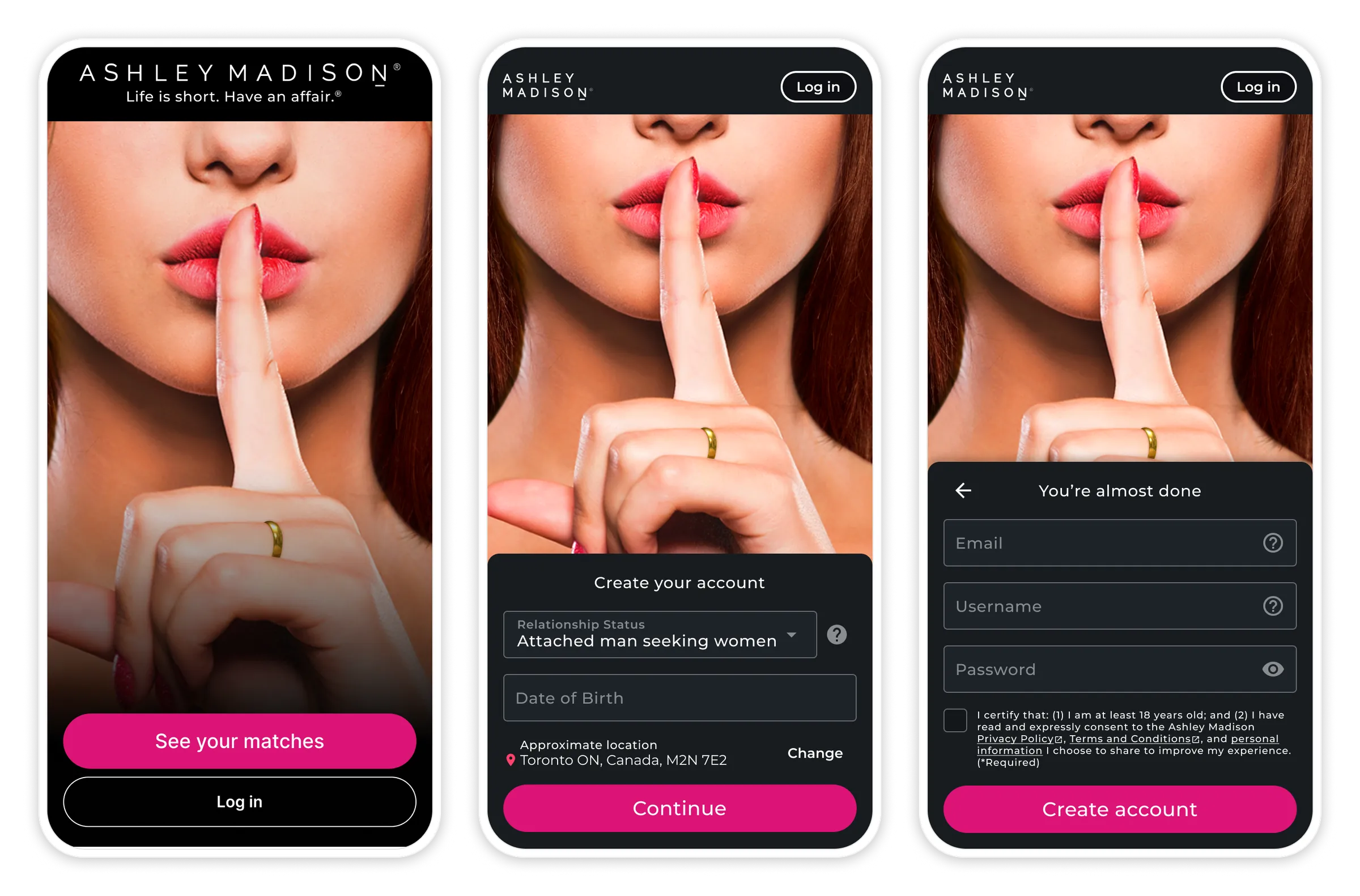
The introduction of the design system significantly improved our workflows. It provided teams with a shared language and reusable components, which proved invaluable in maintaining consistency and streamlining design and development efforts. Ultimately, the system enabled our teams to dedicate more time and energy to tackling product challenges, rather than repeatedly building basic interface elements from scratch.
Lessons Learned
- Design systems compound - A shared language and reusable components freed teams to spend more time on product challenges instead of rebuilding basic UI
- Early buy-in accelerates adoption - Consulting developers and product managers before building created the organizational support needed to roll the system out
- Phased rollout protects momentum - Shifting from a 'big bang' launch to a phased approach after a leadership change kept adoption moving without disrupting in-flight work
Next Steps
- Complete the phased rollout across remaining lower-priority sections of the platform
- Leverage the token architecture to support dark mode and localized, white-labeled versions ahead of international expansion
- Grow contribution guidelines to keep the system consistent as the developer team scales